U gebruikt een verouderde browser. Wij raden u aan een upgrade van uw browser uit te voeren naar de meest recente versie.

Real life (3): The Covid-19 Pandemic                                                          < Previous page       Next page >

See also:

Computer Simulation:
Fox Rabbit Math Model

Computer Simulation:
Fox Hare Field Model

Real life (1):
Lynxes and Snow Hare

Real life (2):
Global Climate Change

On this page:       USA       Netherlands       World       Discussion


Introduction: Cyclic pandemic behavior

(You may perhaps first want to read the short Introduction to Cycles on the page of the Fox Rabbit Math Model.)

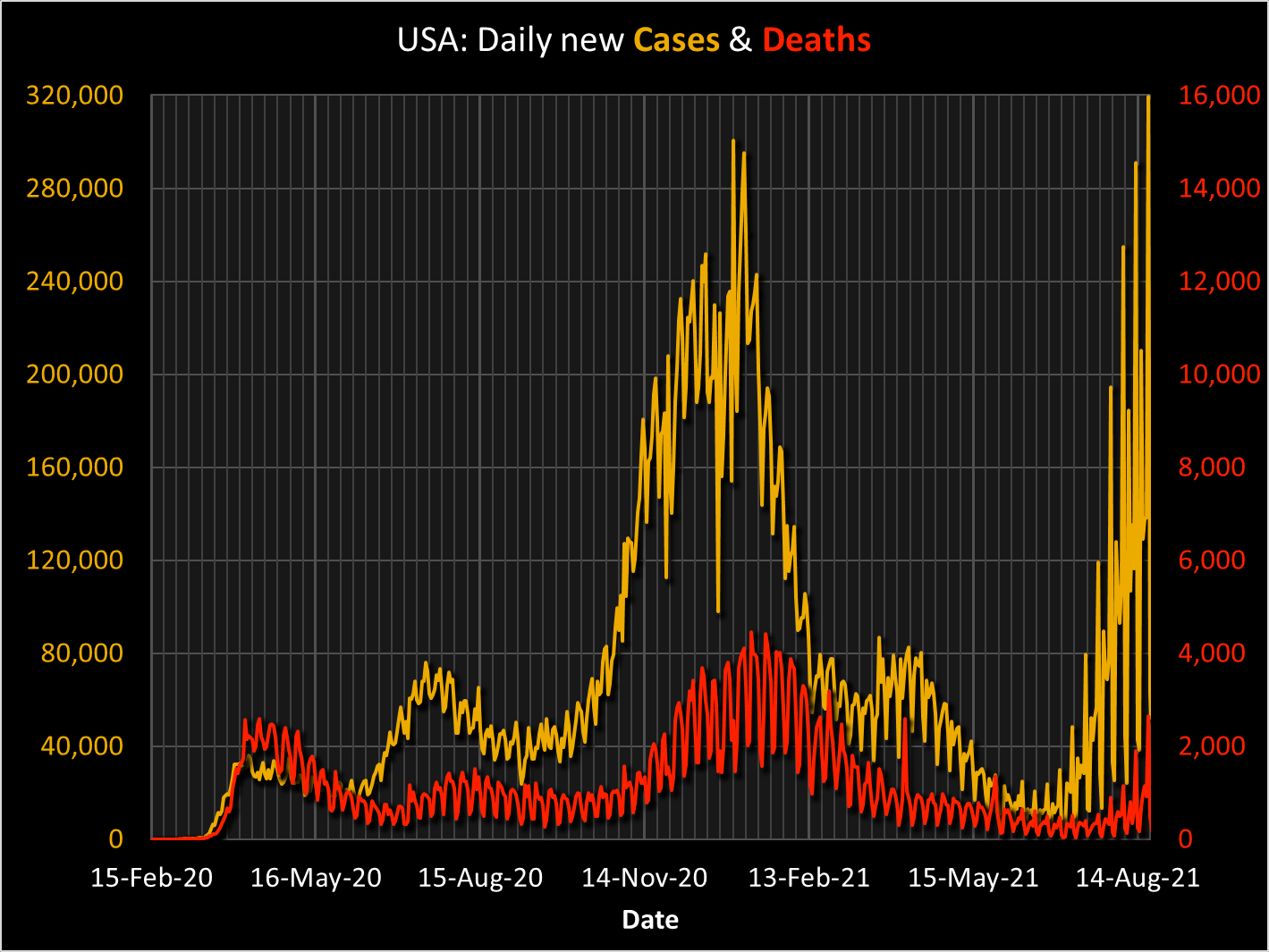
In the Spring of 2020, when the world was suffering from a pandemic caused by Covid-19, there was much talk about a possible second wave, which - after a decrease in the numbers of new cases and of deaths - might strike in the Fall, because when outside temperatures start going down, people tend to come together inside, this raising the risk of infection. After all, the same happened in the Fall of 1918 with the Spanish Flu pandemic, when a massive second wave struck hard and killed many, raging on far into 1919.

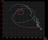
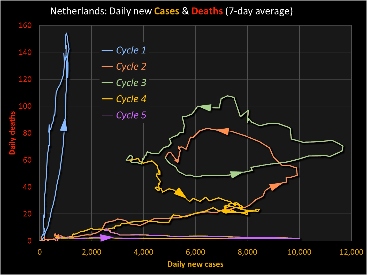
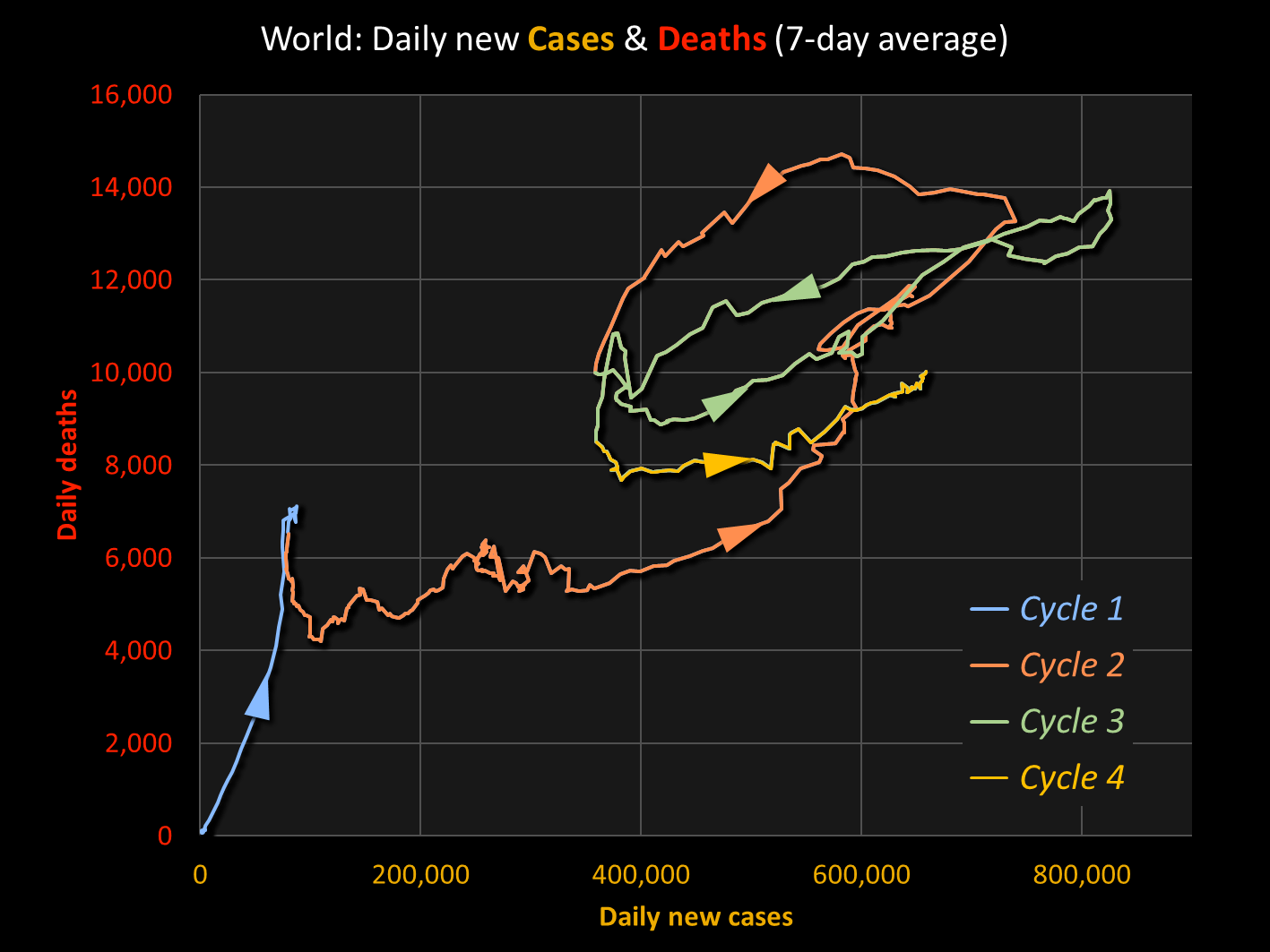
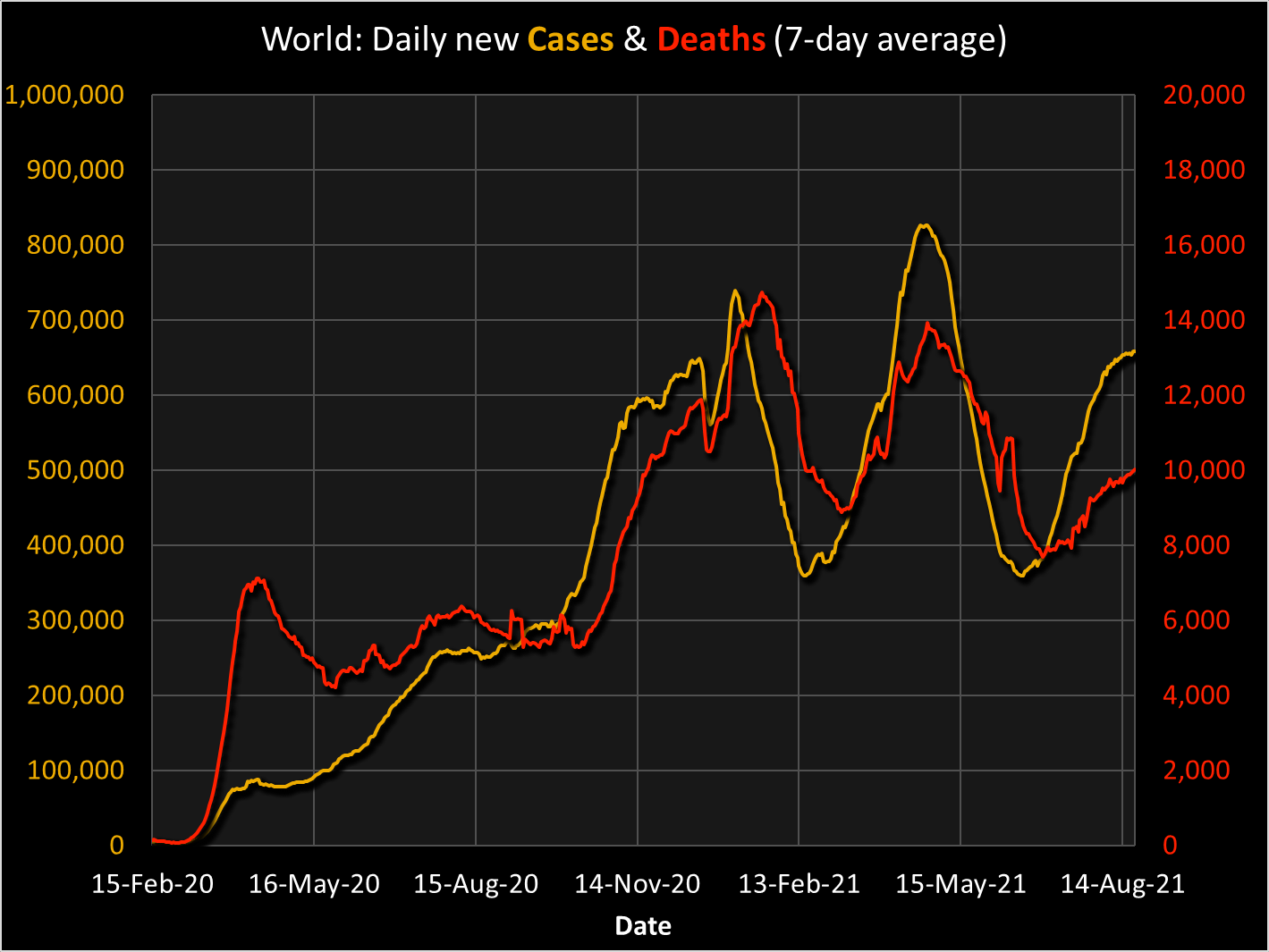
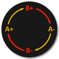
Well, a second wave did arrive. Followed by a third wave  which disturbs this whole picture. Perhaps, something else is going on? The answer is: yes, there is a different explanation, supported by the theoretical models described in the two Fox Rabbit models: cyclic behavior, just as in the four other cases of which you can see the links at the top of this page. The cycles are caused by (at least) two factors ('A' and 'B'), which mutually influence each other, together causing a negative feedback loop.

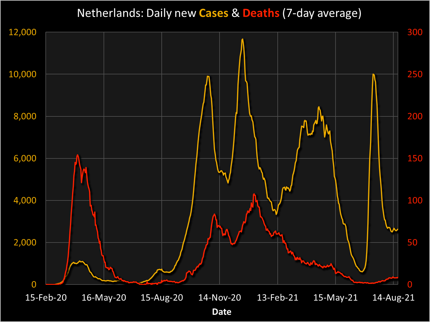
Let's investigate, starting with the USA.


Sources for the information on this page:
    European Centre for Disease Prevention and Control (ECDC) (2020-2021),
https://www.ecdc.europa.eu/en/publications-data/download-todays-data-geographic-distribution-covid-19-cases-worldwide.
    Our World in Data, https://ourworldindata.org/covid-cases.


USA

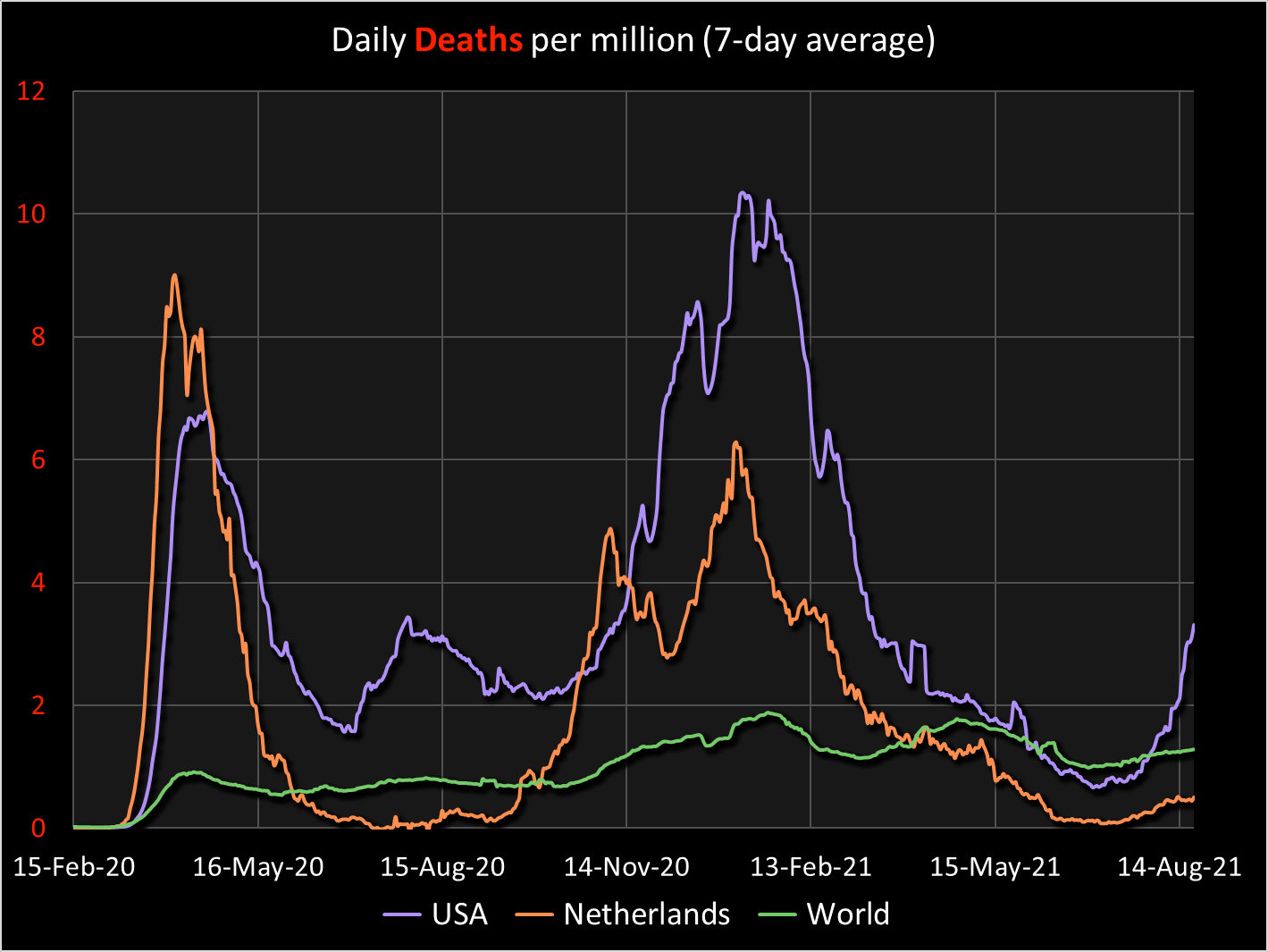
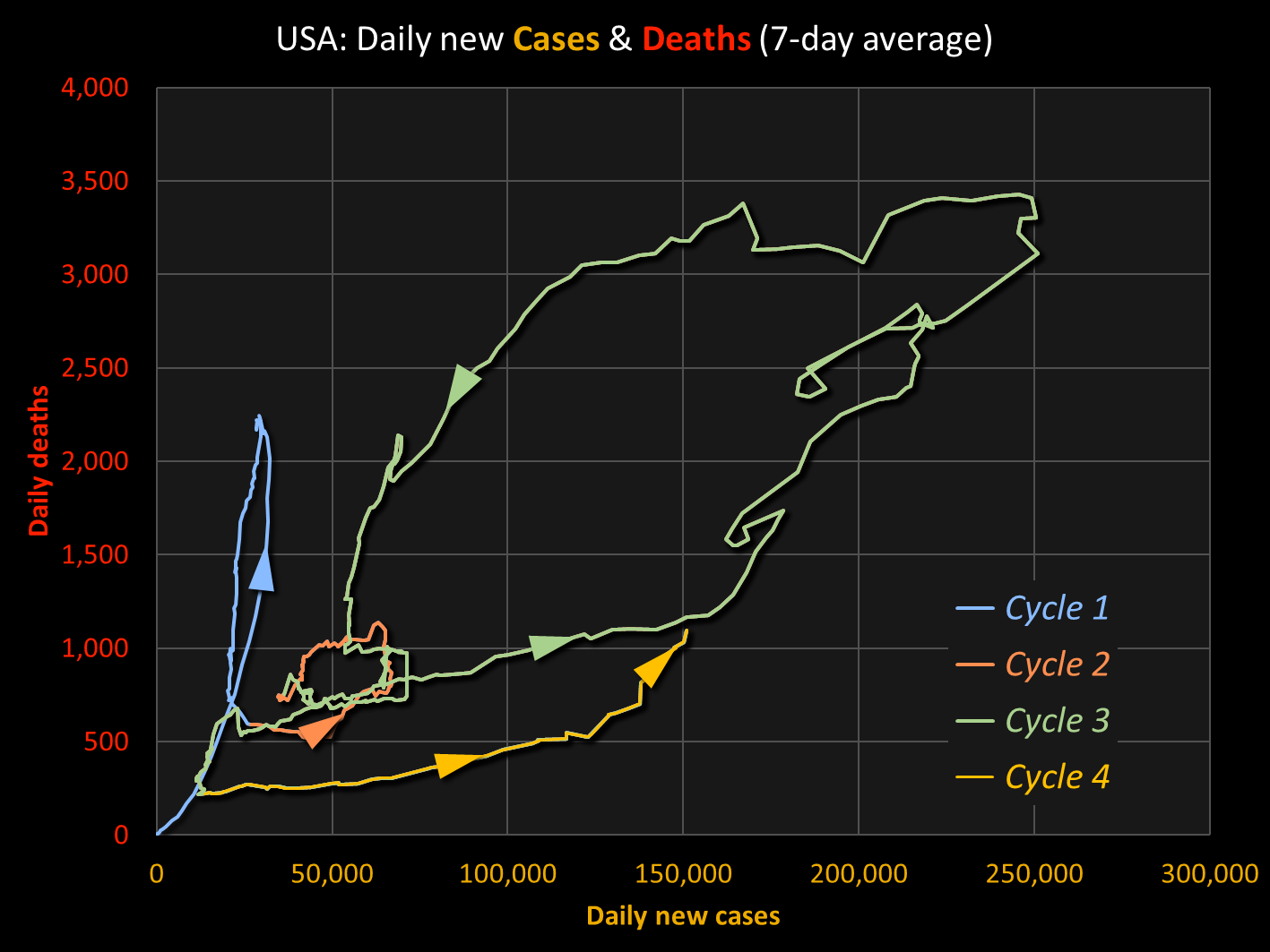
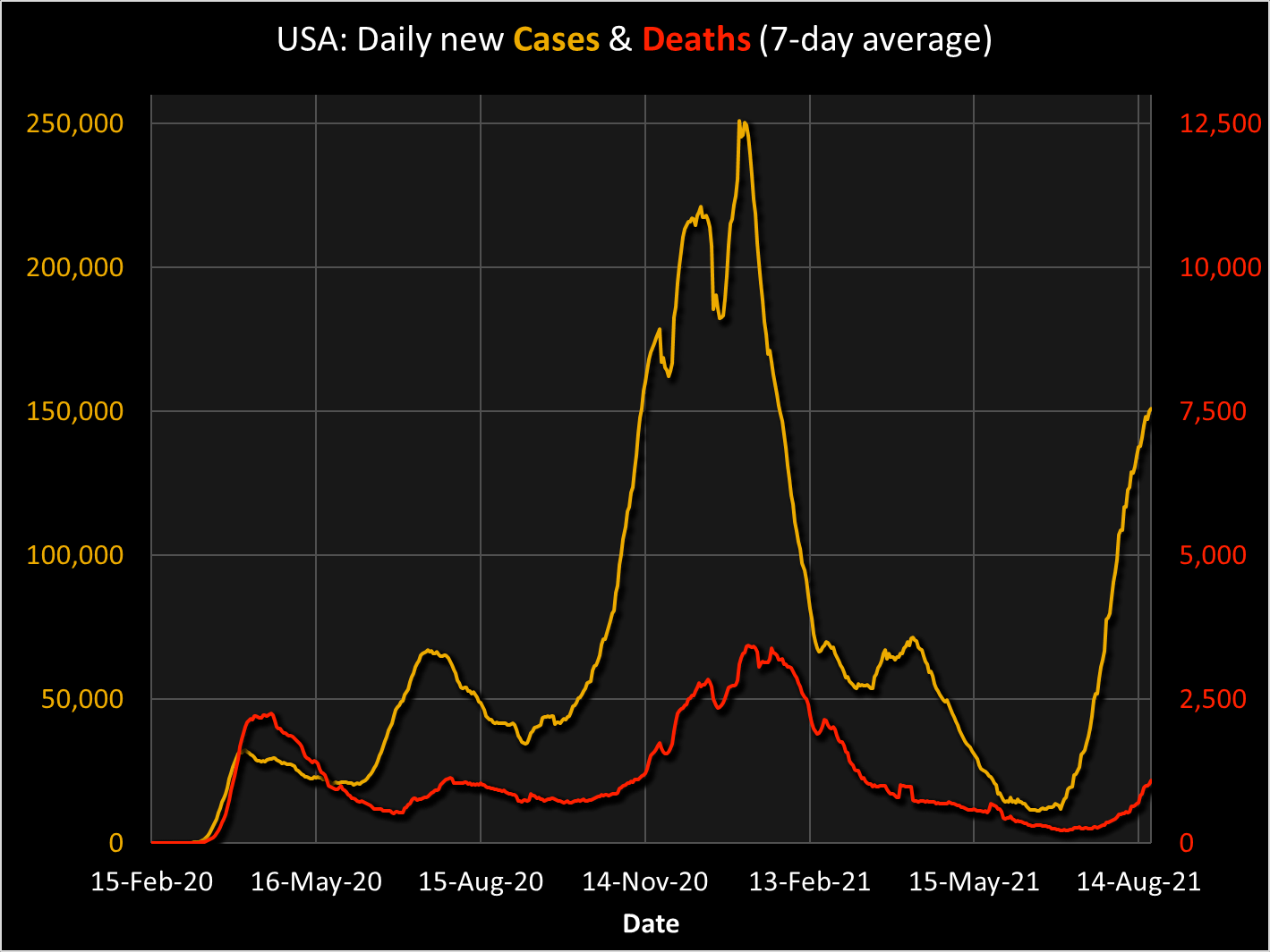
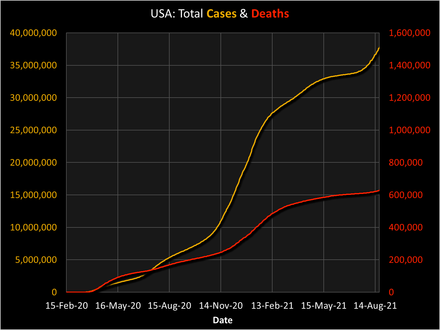
Let's start with the phase diagram of the pandemic in the USA. (The graphs on this page are updated regularly as long as the pandemic rages on.)

The colors of the various cycles have been added artificially, in order to make the graph transparent; they don't have any other meaning. The transition point between the three cycles are debatable; one could argue that the startt of Cycle 2 should be positioned a few days later, but that is not really relevent.

The cause of the process is, of course, people getting infected. So there is 'A', evidently: positioned on the x-axis of the phase diagram. Much more debate is possible when it comes to defining 'B', which is to be depicted on the y-axis. You might think a whole range of possible effects, such as the economic impact, the average size of crowds in the streets, or the level of (un)happiness of the population. The issue with all of these is that they are hard to measure objectively, and are influenced by many others factors as well.

There is one effect however, that is easily quantified in a highly objective way, and fully or mostly caused directly by the infections with Covid-19 itself: the number of people dying from it. So, this is used here as 'B' and depicted on the y-axis.

Does that make any sense? Is it useful, or at least interesting and instructive? See the discussion at the bottom of this page.


Cause and effect
There is no need to explain why 'B' follows 'A': in order to die from Covid-19, people first have to be infected. So, the first step in the causal cycle is easily understood: A+ causes B+.

So is the next step (from B+ to A-): as more and more people get ill, and a certain percentage of them dies, the people get frightened and start social distancing and wearing masks, while the authorities take measures such as (partial) lockdowns. (At least some authorities do, either at a national or a local level.) As a consequence, the number of new infections decreases: indeed, B+ causes A-.

But how can the rest of the cycle be explained? It's not very complicated. The lower number of new infections causes the number of (new) deaths to go down as well, but only after a while, as it takes several weeks before the infected persons show symptoms and again a couple of days or weeks until some of them die. This explains: A- causes B-.

This is all very well: as it seems, the pandemic comes to a halt. But now, it goed wrong. People, and some of their authorities, get the erronic impression that the time has arrived to ease down the measures. Social distancing is forgotten, masks are ignored - at least by a part of the population. Bars and restaurants are allowed to reopen. Big parties are organized, some of them to celebrate the slowing down of the crisis. In general: people develop pandemic fatigue, and consciously or unconsciously, they forget to act wisely. As a consequence, the number of new infections rises: B- causes A+. The cycle is closed.


USA: Four cycles (so far)
This closed cycle is not just fantasy, as the facts prove that this is really happening. The phase diagram of the USA, shown above, shows this convincingly. Some media speak of a 'fourth wave' - although many of them are (as this text is written) still speaking of the current 'third wave', which is clearly incorrect. Anyway, instead of speaking of a fourth wave, there is an important reason to speak of a fourth cycle: again, see the discussion at the bottom of this page.

The wave-like shape is well recognizable in an different type of graph, shown here. On the left side, you see the numbers of new cases (in yellow) and deaths (in red) through time. Please do not compare the relative heights of both curves with each other: they are on different scales, shown in the two vertical axes: new cases on the left, deaths on the right.

Nevertheless is is useful to combine both curves in one graph, as this allows us to compare their phases: naturally, the death numbers lag behind the case numbers, and the combined graph enables the observer to study this time lag.

However, such a comparison is not very transparent, due to the fact that the reports of new numbers have a weekly cycle, as the graph on the left clearly shows: the vertical gridlines within the graph indicates periods of 1 week. During weekends, less new cases and deaths are reported, which is compensated right after the weekend; or it may be the other way around, that depends on the country that is studied. Anyway, it is for that reaqson customary to calcultate for every day the average of 7 days, which eliminates  the weekly differences. The result is the graph to the right. Indeed, this graph clearly shows the time lag between the initial cause (the new cases in the yellow curve) and the effects (the deaths on the red curve). You may compare this with the Fox Rabbit graphs, e.g. of the Lotka-Volterra Model, the Stochastic Models, or the Field Model.

As you may be interested in the long-term effect, also the graphs are shown of the total number of cases & deaths: the USA graph on the left, the one for the Netherlands on the right. Again: please do not compare the relative heights of two curves within one graph with each other: they are on different scales, shown in the two vertical axes: cases on the left, deaths on the right.

Besides: please mind that the vertical scales in the US and the Dutch graphs are different.

The three waves, or better: the three cycles, are still recognizable in the US graph, but this time as bends in the curve, as the slope goed up and down interchangeably.


Netherlands

Speaking of the Netherlands: the pattern in the above graph differs from the American one. This becomes better visible in the phase diagram below to the left, and the time graph to the right.

Both Dutch graphs prove that - on the day this text is updated - the Netherlands are in a fifth cycle, not a fourth one, like the USA. This is striking, as the first wave of the pandemic started in both countries at the same time, as the graphs prove. The reason for this difference is not fully clear, but it may be caused by different policies by the authorities and/or by different individual and group behavior of the inhabitants of the two countries.

Apart from that, there is another consideration. The USA are a much larger country, close to continent-size, and the 50 US states have behaved quite differently. The US graphs shown here are an addition of the processes in the various states, which makes a comparison with the much smaller and more homogeneous Netherlands complicated.


World

Such complications are even more true when the cases & death numbers of all countries are combined. The resulting phase diagram and the time graph, both shown here, are highly irregular, as is to be expected. Here, too, four cycles may be discerned, as in the USA.

In the next two graphs, the three cases - USA, Netherlands, World - are compared to each other. For a fair comparison, this time not the absolute numbers are used, but instead the relative numbers: cases and deaths per million.

For the comparison: the USA has ca. 331 million inhabitants; the Netherlands: 17.13 million; and the World: 7795 million.

In other words: for every Dutch person, there are 19 US citizens; but for each of these Americans, there are nearly 23 other humans in the world.

Discussion

Usually, authorities and media describing the pandemic speak of 'waves'. But there is a good reason to use the term 'cycle' instead.

First of all, this is for a scientific reason: thinking in terms of cycles makes clear that the up-and-down motions of the pnademic numbers are not isolated phenomena. To the contrary: when you compare the page you are currently reading with the four other pages for which the links are shown at the top of the page - two more real-life phenomena plus two computer simulations - it becomes evident that the typical patterns of the pandemic numbers are part of a much more universal principle of cyclic behavior in complex systems.

But there is a much more important reason as well. If not only scientists, but authorities and media as well, emphasize the cyclic character of the pandemic to the main public, many of them may understand much better why it is important to react wisely. As explained above: if pandemic fatigue strikes, and the citizens tend to think that the pandemic will soon be over, the general behavior is relexad, social distancing and masks disappear, bars and restaurants reopen. And this is precisely what causes the next cycle: B- leads to A+, and everything starts all over again.

If this happens over and over again, creating ever more cycles, the only way out will be through a large-scale vaccination program. But even that will only do its job if sufficient people are convinced of the importance of vaccination. Here, too, the notion of cycles may be a better way to achieve this than the notion of waves.

Wise behavior of authorities and citizens would be, at the time that social distancing and other measures appear to be successful and the numbers of new infections and deaths go down: don't relax, but instead: hold on, keep up the measures, until the pandemic is gone or at least diminished to minor proportions. 'Never change a winning team', as the saying goes, or in this case: 'Never change a winning strategy.' This is hard, but the 'cycle' image may help to hold on.

One characteristic of cycles is mentioned in the Introduction to Cycles, on the page of the Fox Rabbit Math Model program. A negative feedback loop causes stability. In many cases, such stability is a good thing. Unfortunately, in the case of the pandemic, we meet an undesired kind of stability: the continuation of the pandemic. What we need is: breaking the negative feedback loop. This will hopefully be achived with the aid of vaccins. But perhaps it can already be reached earlier, when a 'winning strategy' is continued until the battle is won.

< Previous page       Back to Top       Next page >