|
|
Source: The text and the images in this section were published in Chapter 6 of: N. Roorda: Fundamentals of Sustainable Development (English, 3rd edition, 2020); they are also available in Dutch in Basisboek Duurzame Ontwikkeling (4th edition, 2020) and in German in Grundlagen der nachhaftigen Entwicklung (Springer Vieweg, 2021). Several exercises that are accessories to these books apply the PopSim computer program.
 A large number of models have been developed for the purposes of studying our future. The United Nations, for example, uses models to chart the expected growth of the global population. When creating such models, many issues are naturally simplified, otherwise they would be impossible to generate. Assumptions are made about future developments, such as possible new discoveries of metals, oil and other resources, as well as new technological developments. Different scenarios can be generated through adjusting the assumptions, and so some scenarios result in a higher population growth than others.
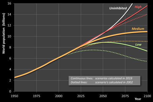
Standard practice is to represent the results using a ‘high’, ‘medium’ and ‘low scenario’, as can be seen in the UN example in the figure on the left. For the purposes of comparison, a scenario of uninhibited growth is included, which is (fortunately) not realistic.
For the purposes of comparison, a scenario of uninhibited growth is included in Figure 6.17, which is (fortunately) not realistic. The ‘high’ scenario is based on the ‘Upper 95’ estimates of the UN’s World Population Prospects published in 2019; likewise, the ‘low’ scenario is based on the ‘Lower 95’ estimates.
The four scenarios share the same starting point on the left, which is logical as it represents the past, which is already known.
Also added are the ‘medium’ scenarios based on the earlier UN Prospect of 2002. It is striking that, through the years, the medium expectations are getting higher. In 2002, it was expected that the world population would peak around 2075. Current forecasts do not even expect a maximum before or around 2100, which is not very good news. The corrections are mainly due to an unexpected high population growth in Africa.
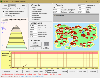
With the aid of a model such as this one it is possible to examine “what if…” questions. “What if the natural environment can take more than we thought?” “What if we have an Aids vaccine within a decade?” These and any other relevant questions can be studied. Such assumptions are translated into scenarios, calculated in the form of simulations, and the results are examined. This allows us to develop a picture of the future – or rather, of one possible future.
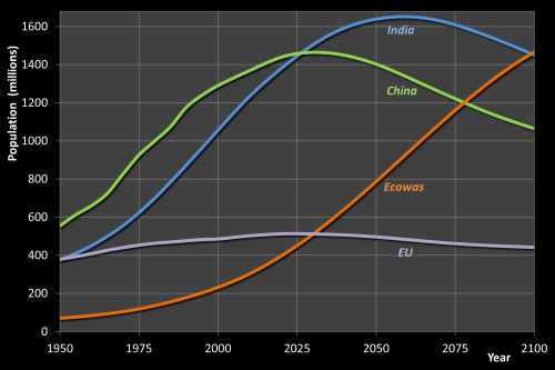 Aside from investigating growth forecasts for the entire world, the UN’s growth models also allow us to examine those for a region. The figure on the right contains the graphs for the four regions that were dealt with in the previous chapter, with the section to the left covering the past and that on the right dealing with a possible future. A medium scenario has been used for each of the regions.
It is interesting that the four lines in the figure fit together like pieces of a puzzle, as if they are part of the same development, just at different stages. Take first the ECOWAS curve, and next the India, China and EU lines in succession and place them side-by-side, overlapping slightly. This will provide a graph resembling that in the figure below, which is not coincidental, as the four regions are undergoing a process within which a number of the processes correspond to each other. This development can be considered as a ‘standard scenario’.
The ‘standard scenario’ has already played out – partly or wholly – in many places, in many forms and at many speeds. In general, the development roughly goes as follows.
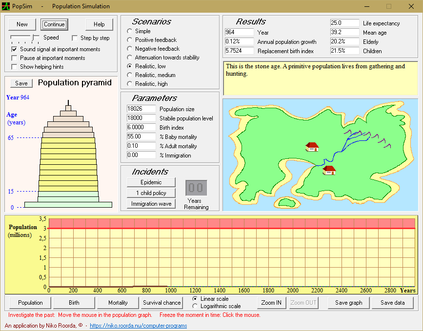
The story that the figure tells starts off in prehistory, and in the far left of the graph the people are still subsisting from gathering edible plants and dead animals, as well as from some hunting. The fertility rate – the number of children per female – is high, but there is little population growth as the infant mortality rate is also high as a result of disease and accidents, amongst other things. This is actually fortunate, as only very few people following this lifestyle can live off the land – no more than a couple on each square kilometer.
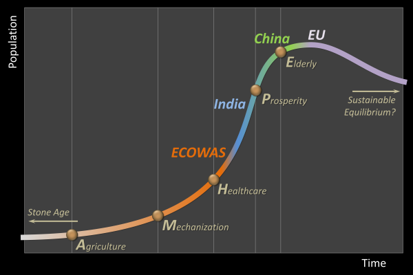
And so it takes a long time, maybe even thousands of years, before the population reaches a density where it becomes impossible to continue this, and once that point is reached, famine becomes an issue. This necessitates a new lifestyle, which is either invented or adopted from neighboring regions – agriculture (A in the graph).
The shortage of food declines thanks to agriculture, and the people’s health increases, pushing up population growth. But the introduction of agriculture is not totally idyllic, as farmers have to work harder than hunter-gatherers and dependency on weather conditions increases – there is always the chance of failed crops and livestock diseases! The new lifestyle makes it difficult to maintain a nomadic existence, and so permanent homes are built.
Agricultural productivity increases where this transition is successful and, because more people can survive per square kilometer through agriculture, the population can grow unabated for a time. Over the course of hundreds or thousands of years, villages and towns come into being, and the population density continues to rise. In due course agriculture itself proves insufficient to feed all the mouths, despite innovations such as the plough and the use of draught animals.
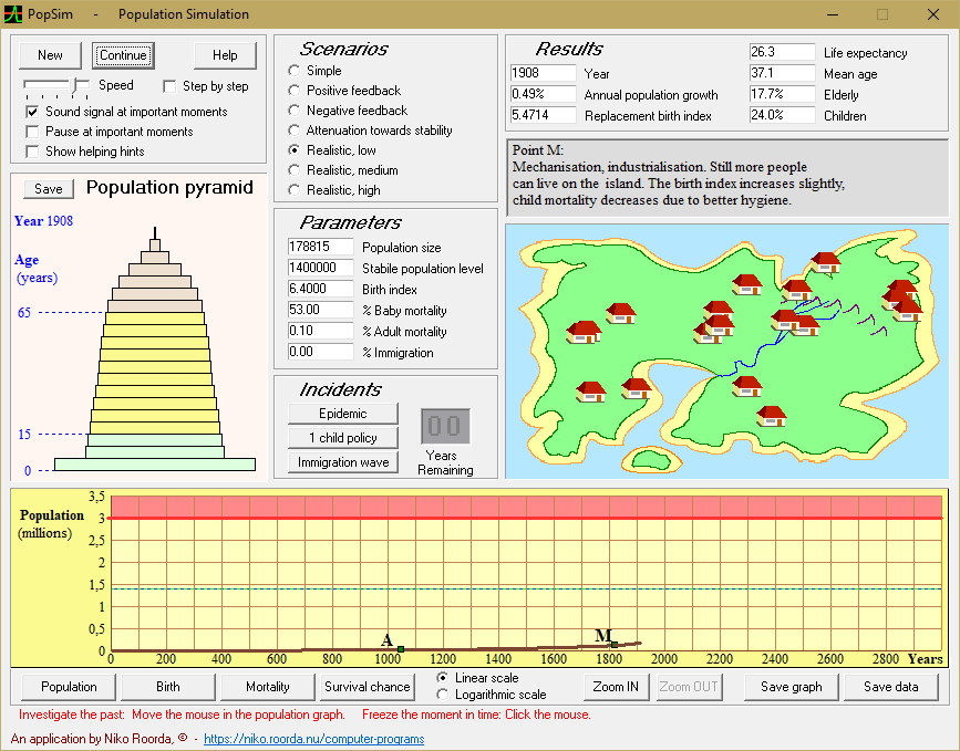
And so mechanization (M on the graph) is introduced at a certain time. Windmills are amongst the oldest forms of this mechanization. This is followed by industrialization. In Europe and America, it is now the 19th century. Coal becomes the main source of energy, with oil employed next. Artificial fertilizers are introduced in agriculture. But the population growth is still not dramatic, as both the fertility rate (the birth-index) and infant mortality are high. In spite of this, the population is considerably larger than it was before, because the growth is exponential, as can be seen by the characteristic shape of the figure (to the left of H).
Hygiene and healthcare improvements and vaccination then result in a radical change (H in the graph). Infant mortality decreases greatly. But the birth-index does not significantly follow. This is logical, as there are still no centrally-organized provisions for old-age, such as pensions. Adults need their offspring to care for them when they become elderly. Besides, there is little or no opportunity to restrict the number of births, with contraceptives not yet existing (in Europe) or not widely available (in the ECOWAS region).
This results in the population skyrocketing – the graph suddenly becomes much steeper between H and W – and there is a population explosion, a baby boom.
Meanwhile, education also improves and the population’s level of knowledge increases. Together with industry, this leads to increased prosperity (P), which allows for pensions to be introduced, taking the pressure of having many children off the parents. The fertility rate decreases, and the population explosion slows down.
The combination of a fast-growing population and increasing prosperity ups the pressure on the environment. Ever greater areas of land are subjected to cultivation, for which the natural environment has to give way, while dumping and industrial discharge spoil the habitat.
Once the population growth slows, the baby boom generation starts to mature and a large group of people reach retirement age while far fewer children are born. This means that a region is confronted with an aging population, i.e. with an increasing percentage of elderly people (E in the graph).
A point is ultimately reached when the population starts to shrink instead of grow. This is already the case in a number of European countries, including Italy.
One can envision many variations to this ‘standard scenario’. For China, M and H are much closer together than they are for Europe, which means the population explosion occurred relatively early. Another feature for China is that the decline in the population growth has not only been due to increased prosperity but also to intervention by the authorities. In another region, Russia this time, the deviations are different – the population is shrinking even though the people have not peaked in terms of prosperity. Russia does not fit well into this standard scenario as it is beset by a long-term economic downturn, with many Russians no longer optimistic about their future.
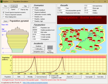
What happens after the E on the graph? Will Malthus prove correct, and will our civilisation collapse, or will we be able to attain equilibrium? We do not yet know what the outcome will be, but it can be said that it is a rare event for a civilisation to reach a point of equilibrium. Of all the civilisations that have ever existed, some fell apart in a calm and peaceful manner before reaching E. Others are still developing and have not yet reached that point. Only a very few have found a stable balance. These cultures, which had abandoned issues such as population growth and overexploitation, were mostly in small areas – generally isolated islands – where no technology comparable to that of today was developed. Our civilisation, the stage at which it finds itself and the global nature of things, together constitute an ‘entirely new experiment’ in world history.
In order to find out what might happen next, we can turn to models and simulations.
End of citation from Fundamentals of Sustainable Development.
|
|
Realistic scenarios
Please, don’t take the word ‘realistic’ too literal. These scenarios are, just like any other, a simplification of reality. But, contrary to the purely theoretical scenarios described above, the so-called realistic scenarios approach reality to a certain degree. There is a resemblance with the Standard Scenario described above.
In these scenarios, you follow the history of humanity, starting from prehistoric times, when even the earliest forms of agriculture had not yet been developed. In the course of a period of 3000 years you will see how a human civilization develops: first the introduction of agriculture, next early forms of technology, followed by a gradually improving healthcare, and so on. At certain moments the real history of various regions of the World will be recognizable.
It is recommended, when running a realistic scenario, to let the simulation pause automatically at important moments (check the appropriate box), which will give time to read the announcements on the bulletin board.
 The scenarios are:
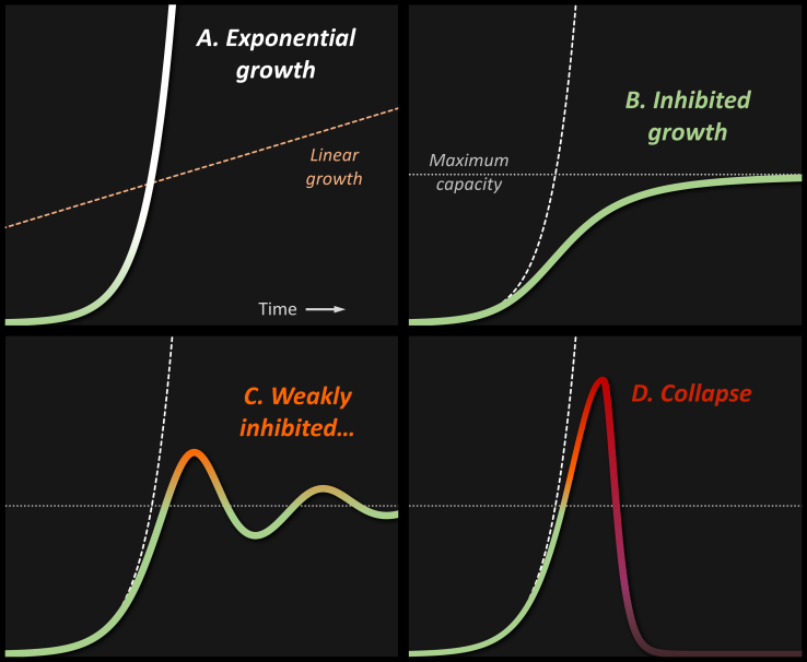
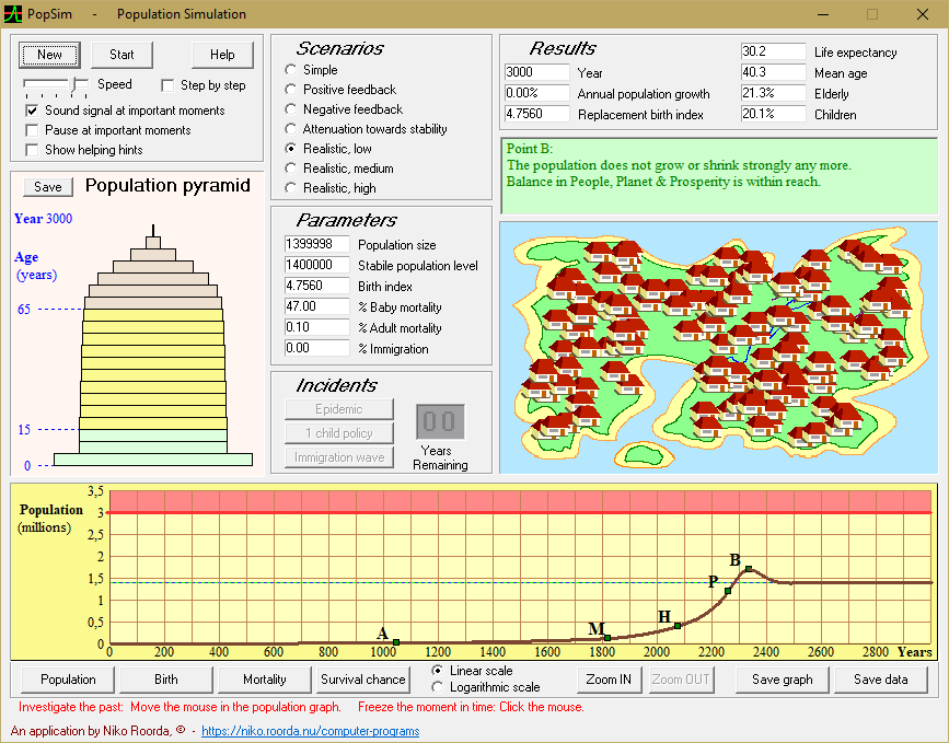
- Realistic, low
This scenario assumes that the population reacts fast and efficient to changes, such as the introduction of agriculture or an improved healthcare system.
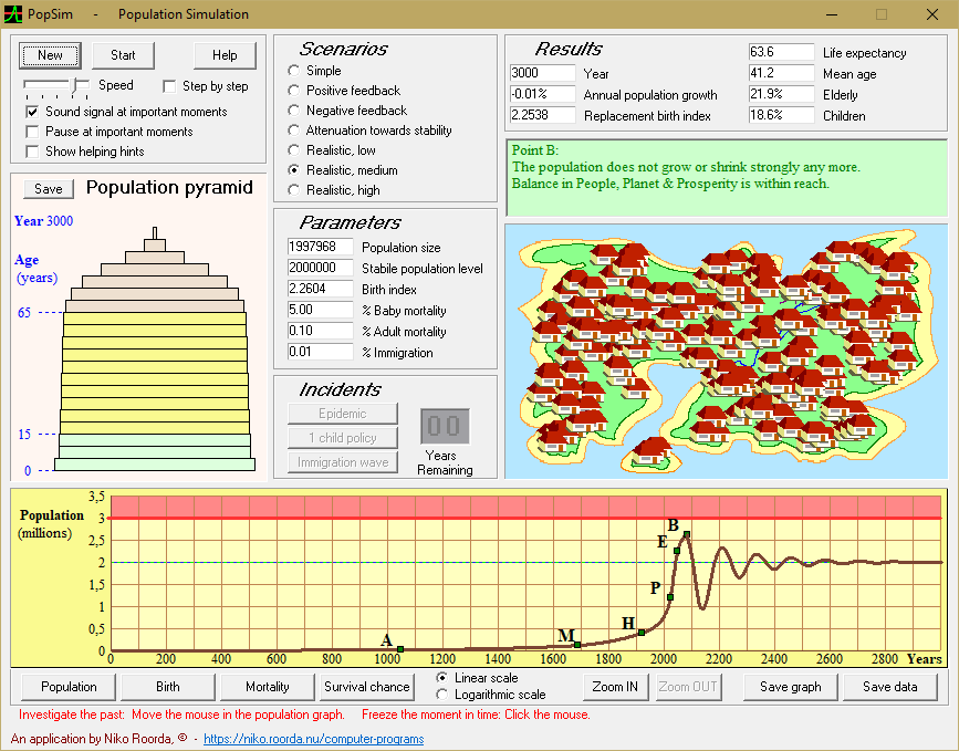
- Realistic, middle
In this scenario the population adapts less flexible to changes. But not as slow as in:
- Realistic, high
When you study this scenario, you will see the consequences for a population that is having difficulties to adapt to changing living conditions.
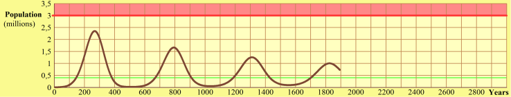
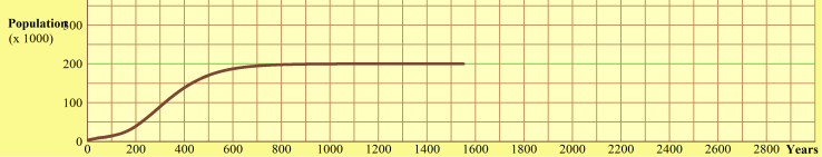
By the way: the wave-like shape of the graph that results in the 'Realistic, middle' scenario has been the source of inspiration for the wave-like shape on the cover of the textbook Fundamentals of Sustainable Development: if you compare both shapes, you will recognize the similarity.
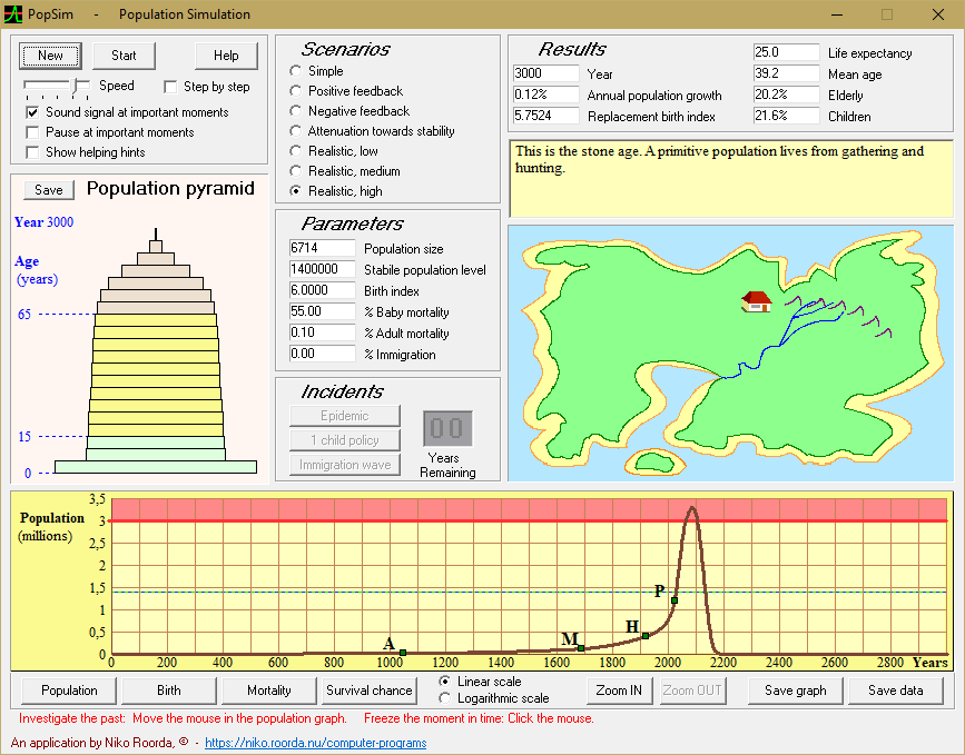
Each of the 'realistic' scenarios starts in the Stone Age
| After the introduction of agriculture (point 'A'),
|
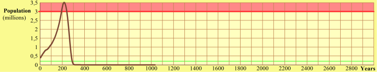
Low scenario: all goes smoothly and ends well...
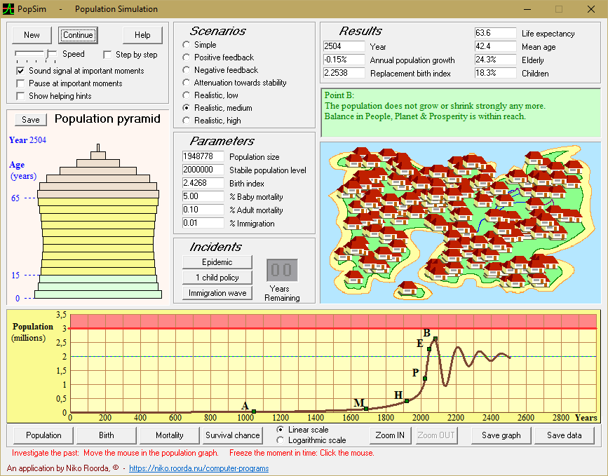
| Middle scenario: the end is all right,
|
High scenario: well, see for yourself how it all ends...
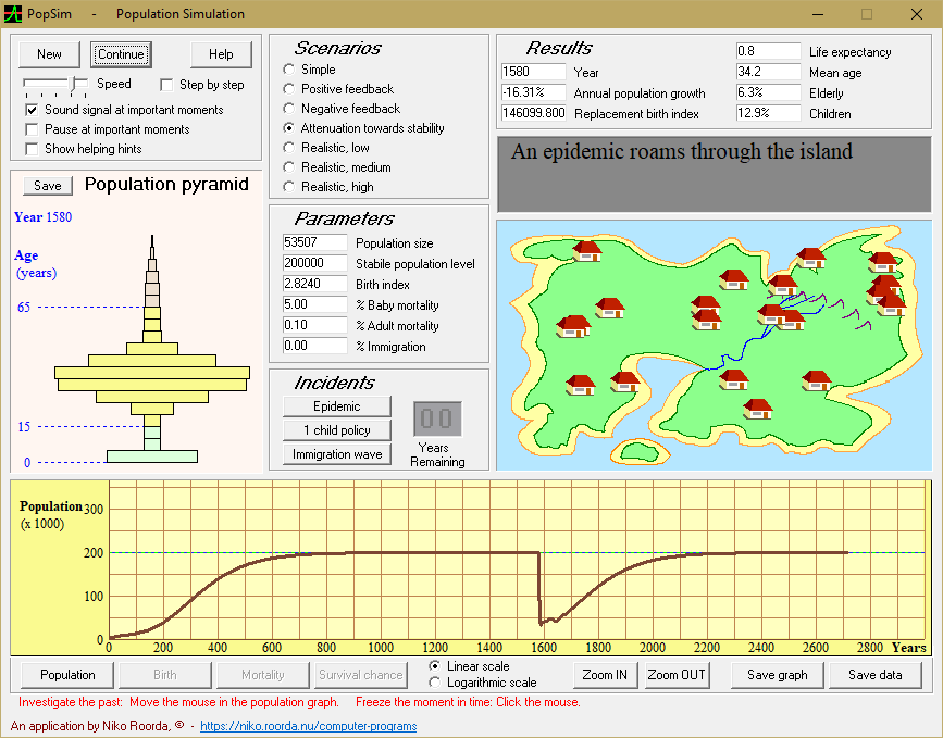
| In Popsim, you can influence the scenarios by giving alternative values to the parameters. Or with 'incidents', e.g. an epidemic...
|